How to Create an Email Marketing Strategy that your Subscribers will Love
This content has been archived. It may no longer be relevant
Tips on creating an email marketing strategy that will increase your subscriber list, open rates, click-through rates and overall traffic to your website.
Earlier this year, I overhauled our entire email marketing strategy. At the time I had less than 100 subscribers. My open rates were very low and my click-through rates were just about nil.
I knew I needed a drastic overhaul if I wanted to see an increase in subscribers, open rates, click-through rates (CTR) and traffic back to the See Girl Work blog.
Social media may have better engagement rates, but email has nearly three times as many user accounts as Facebook and Twitter combined.
And while Facebook and LinkedIn continue to change their algorithms, email continues to provide the most effective method of reaching your readers, customers or clients.

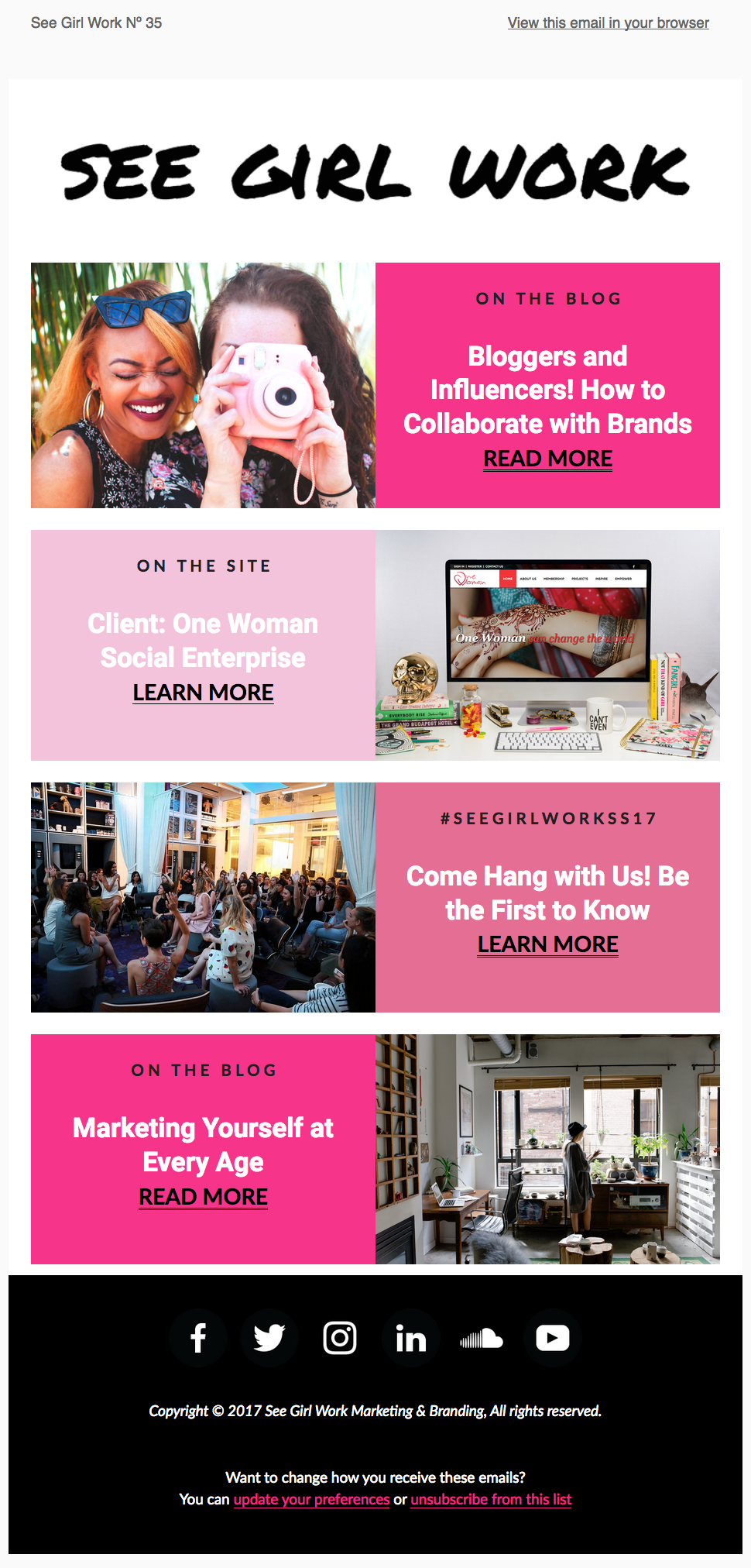
An example of one of our January emails
Below I’ve detailed how I overhauled my emails and created an email marketing strategy that has increased my subscriber list, open-rates, CTR and blog traffic.
1. Visual Impact
Design and layout was the first thing I focused on for my email marketing overhaul. I wanted to infuse more of the See Girl Work brand into the email.
From including your brand name in the “from” field to using an identifiable address, brand optimization is by far one of the most crucial email design best practices.
I also changed the layout including how it should look, its size, the text to be used, the fonts, the colours — everything about the visual layout of our emails. I wanted our emails to truly become an extension of the See Girl Work platform.
Using my blog categories as a guide, I decided to create sections to display in each email. Each section contains a section title, an image, a headline and a call to action. I limit each email to only contain four or five sections for better visual emphasis.
When it comes to email marketing, graphics and imagery should define content sections clearly.
If you’re using short sentences and paragraphs in your emails, make sure you use design elements like spacing and dividing lines to separate content sections. My content sections are separated by use of our brand colours.
2. Copy and Content
Previously, I used to write each email in an effort to create a personalized feel. However, it became time consuming and I wasn’t able to automate my emails.
Also, I began to feel like my long letters were distracting people from clicking-through, which was ultimately what we want as content creators. Over time, I also felt like my letters were becoming boring and redundant.
As part of my overhaul, I removed the letter writing portion of my emails. This has made it easier to automate days or even a full week in advance. My email content now focuses on our blog content, interviews, resources, our workshops and special events.
In order to create content that your readers and subscribers will love, it’s important to understand your goals and what you’re trying to get out of your email strategy.
My goals were to increase traffic back to my blog, showcase the variety of content we publish and to increase awareness of our events and workshops.
3. Email Automation
Another step in my email overhaul was to take advantage of MailChimp’s automation tools. MailChimp Automation allows you to create a targeted series of emails that send when triggered by a specific date, event, or subscriber’s activity.
I set up a Welcome Email Automation to greet new subscribers after they join our mailing list. This is a great mechanism to begin to nurture a brand new relationship with your new subscriber.
With a Welcome email, I am able to introduce each new subscriber to all the different things we do here at See Girl Work. From our blog content to the podcast series to our workshops and events, I’m able to educate each new subscriber about our platform.
The Welcome email also introduces new followers to our brand and informs our new subscriber on our tone of voice, personality and overall mission.
This is a paid feature, but the return on conversion is worth the investment.
4. Time of Day Optimization
When it comes to email marketing, it’s also important to figure out the best time of day to send your emails.
There’s no hard and fast rule when it comes to the best times for emails. I did a lot of testing in this area.
I was previously sending our emails out during the evening time. I even tried sending them on Saturday mornings. But I wasn’t really happy with the results.
As part of my email overhaul, our regular emails are now delivered on Wednesdays around noon, while our special announcement emails are delivered on Mondays.
5. Landing Page
Setting up a landing page almost instantly doubled our mailing list.
A landing page easily captures your reader’s information and sends it directly to your subscriber list, allowing you to then send your autoresponders for nurturing such as my Welcome email example.
Our landing page vastly improved the conversion rates of my email marketing. You can set up a landing page directly on your blog or by using a service like Leadpages, Unbounce, Instapage, or ConvertKit.
Final Thoughts
Email marketing gives businesses and online publishers the power to reach customers in a place most people visit every day ─ their inbox.
Email marketing for small businesses isn’t just important, it should be a key marketing tactic built into every organization’s business plan.
I’m happy with the increase in subscribers and traffic that my email overhaul has generated. It’s been a worthwhile investment.
Have you tried anything new to increase your email conversion rates? Looking forward to hearing about any additional tips that I should try to implement in the comments section.
In the meantime, see our new email marketing strategy in action by joining our mailing list.
Image via HubSpot
Comments: 10
-
Pingback: Weekly Marketing Task List - My Blog
Leave a Reply
You must be logged in to post a comment.


Pingback: The Cost of Blogging for Business | See Girl Work Blog